The Pulse of Color

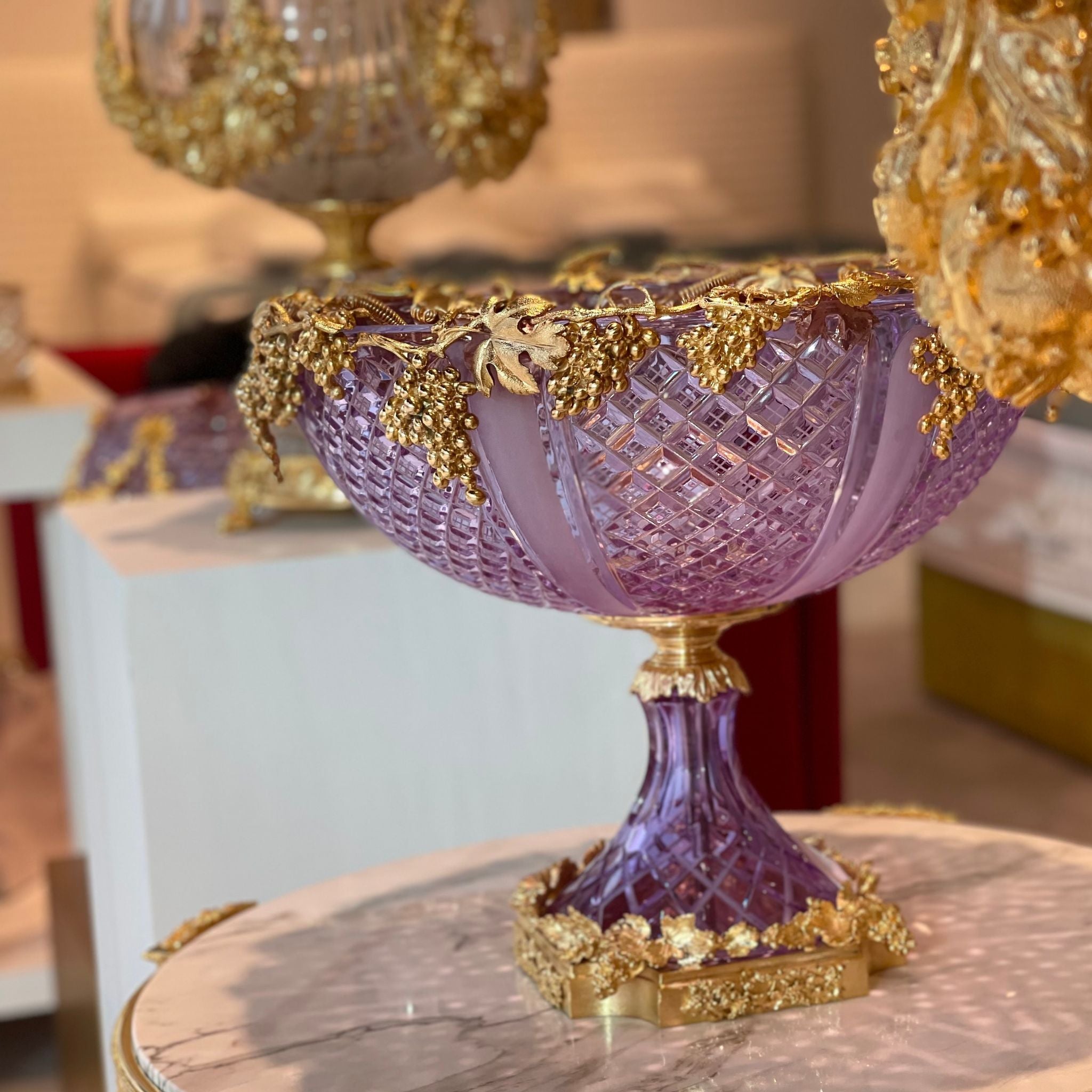
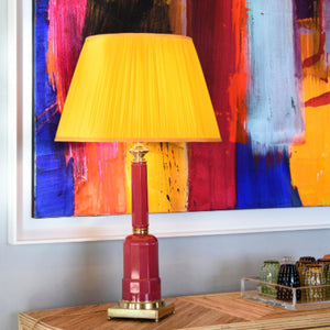
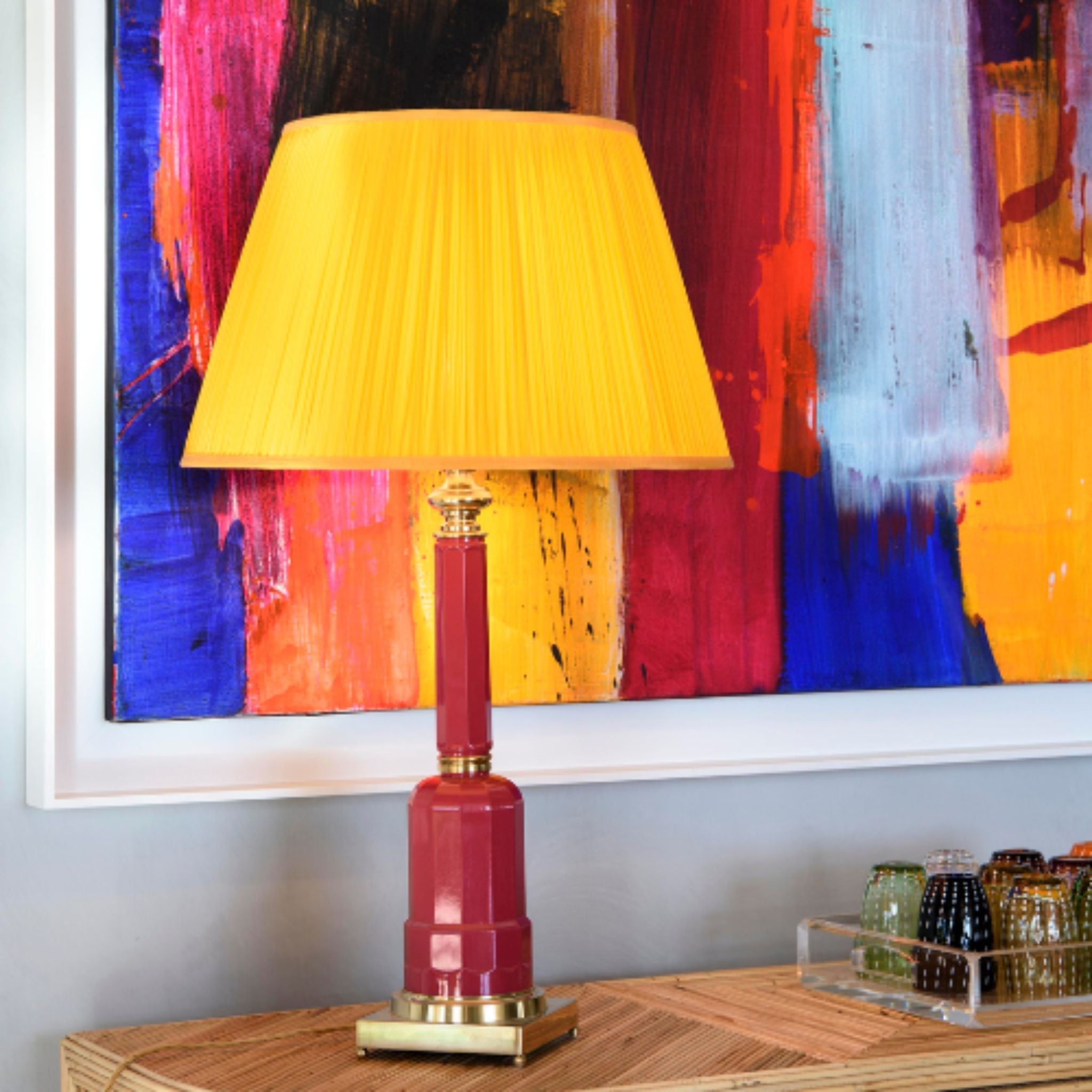
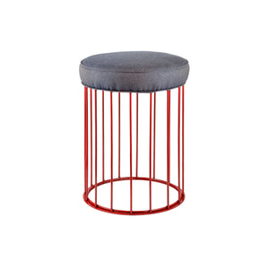
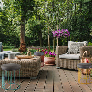
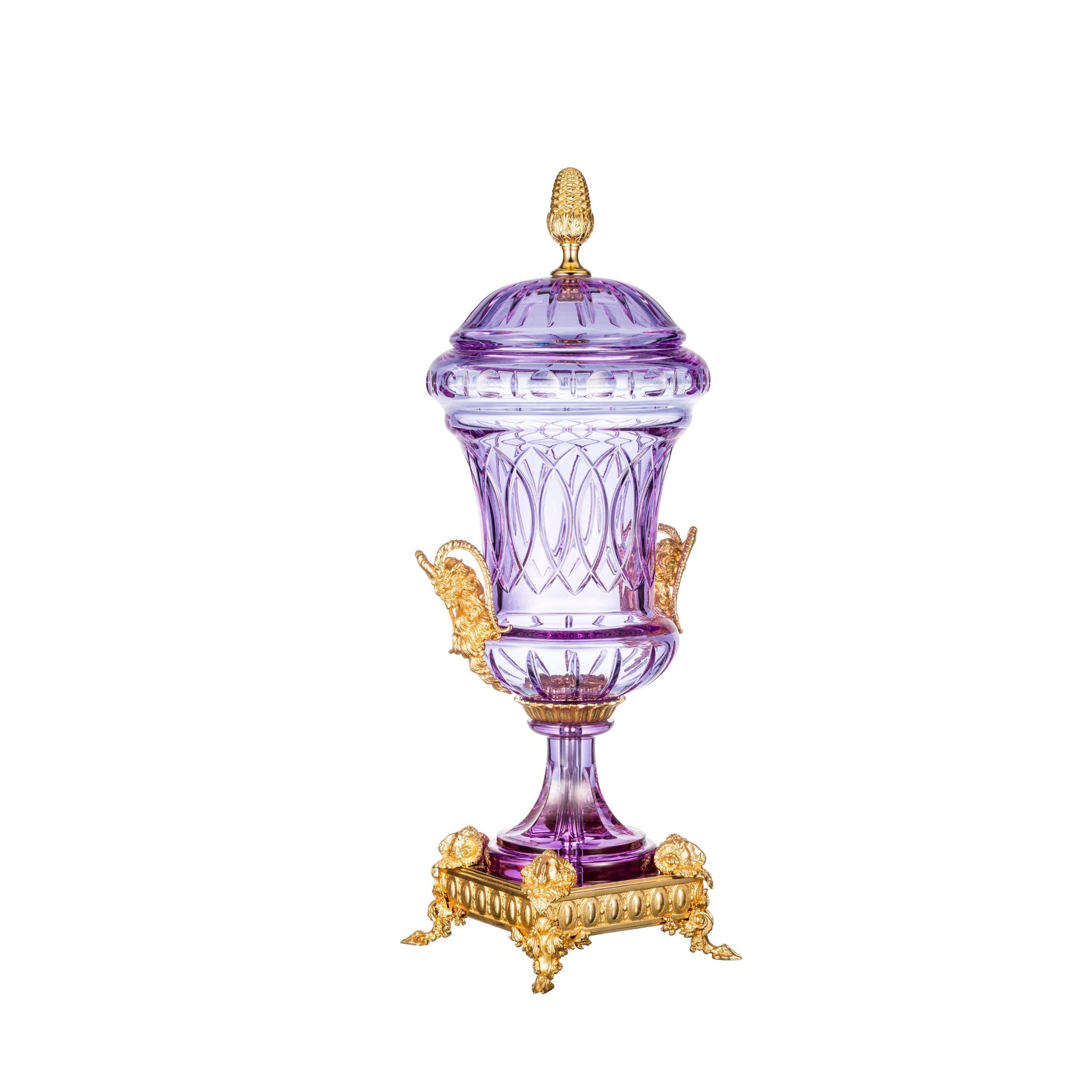
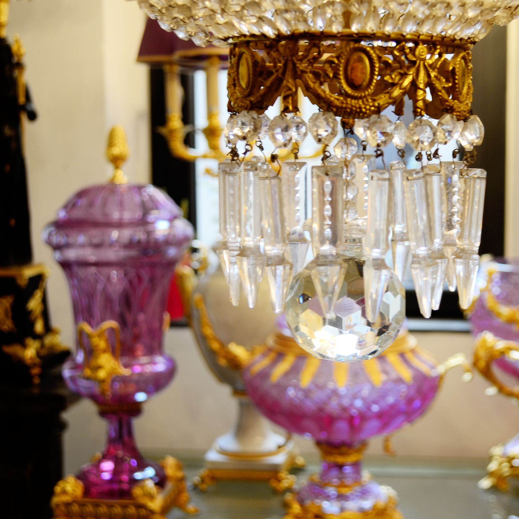
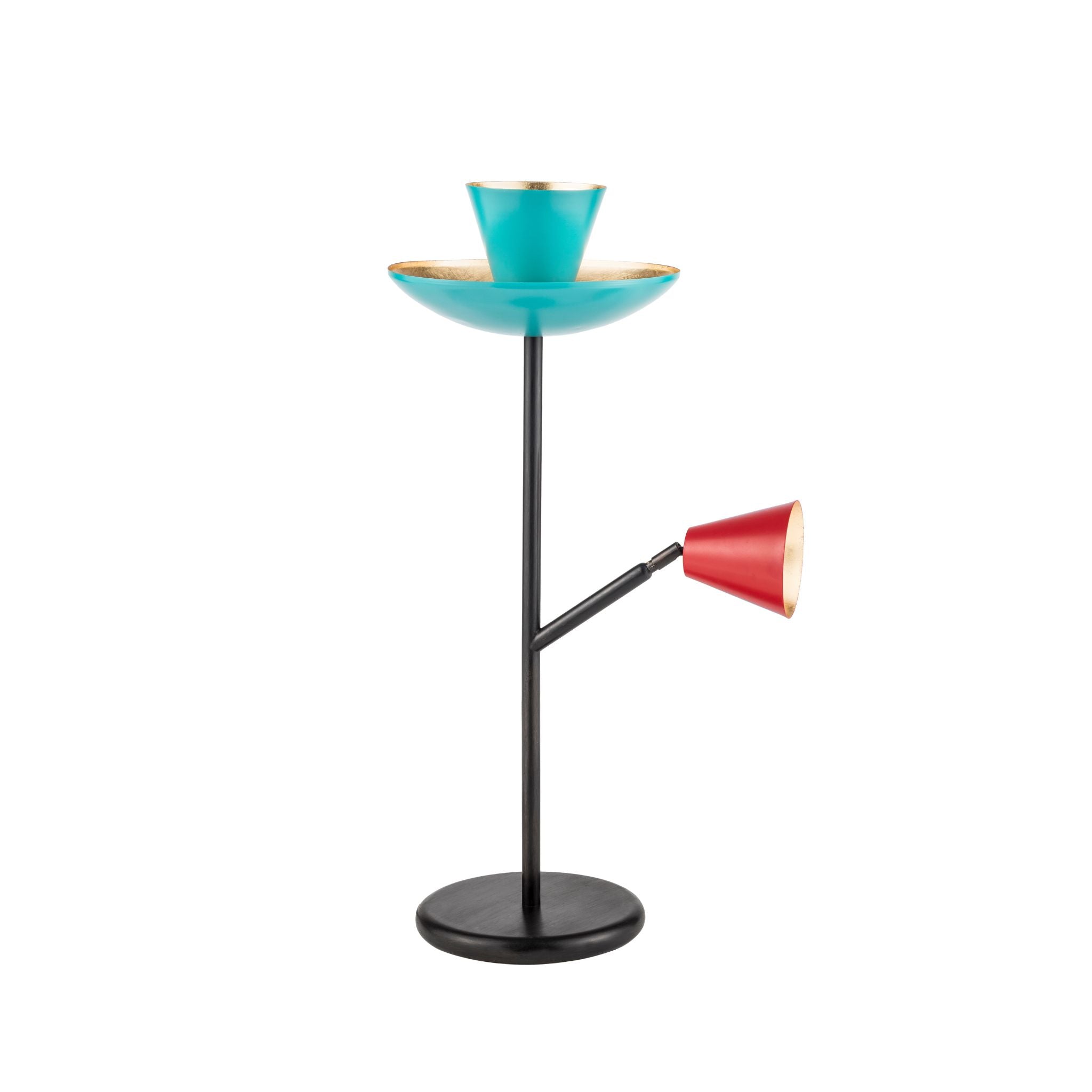
Color as the vital impulse of design

Color is not decoration. It is not a finish.
It is a living impulse, a silent rhythm that moves through materials, shapes light, and gives form to the identity of a space.

There is an invisible pulse flowing through surfaces, reflections, and transparencies. A chromatic energy that animates objects, amplifies their presence, and reveals their soul.
This is the Pulse of Color — the heartbeat of color — which we follow in every detail, every design choice, every accent that speaks through glass, metal, and light.

Color and history: a timeless sensitivity

Color has always carried narrative and symbolic weight in the world of interiors.

The Romans used mineral pigments to adorn walls and floors with deep reds, lapis blues, and vibrant ochres.

During the Renaissance, color became an intellectual tool, shaping perspective and atmosphere.

In the 20th century, design rediscovered color as a cultural and graphic statement — from Bauhaus rationalism to the vivid energy of Pop, from the dusty tones of Mid-Century to the glossy contrasts of Postmodernism.

In every era, color told us who we were — and who we aspired to be.

Refractions that become emotion

In crystal, color is not just a tint: it is sculpted light. It’s refraction, depth, transformation.

Some crystals appear clear at first glance, but shift in hue under different lighting, like living matter. Others, such as overlaid or cased crystals, reveal multiple shades through engraving and polishing.

Color in crystal is never static or predictable — it’s emotive, dynamic, and ever-changing. It resonates with its environment, turning into pure visual poetry.

Light always carries color

Light is never neutral.
Its temperature — warm, cool, or neutral — defines the emotional tone of a space.
A warm 2700K light envelops interiors in intimacy; a crisp 6000K light stimulates energy and clarity.

Even the color of light has become a stylistic code: the golden glow of Belle Époque gas lamps, the bright white of modernist interiors, the moody dimness of post-industrial spaces. Today, we can fine-tune every nuance to paint a room with emotional precision.

Lampshades as chromatic statements

Metal lampshades — whether enameled or patinated — are three-dimensional palettes.

Glossy or matte, bright or muted, their colors aren’t just aesthetic: they define the identity of an object.

From the 1950s through the 1970s, design embraced saturated tones, color blocking, and metallic finishes. Today, those bold gestures inspire new expressions, turning each lampshade into a statement piece of design language.

Metals that vibrate with light

Metals speak in color too.
Brass, copper, bronze — each carries its own tone, warmth, and vibration. Whether polished, satin-finished, aged or patinated, these are chromatic decisions, not just technical ones.

In Art Nouveau and Art Deco interiors, metals added opulent golden reflections. In modernism, they were dulled, softened, made architectural. Today, they once again interact with light, warming spaces with nuanced reflections.

The hidden heartbeat of design

Color is all this. Not an afterthought, but a profound presence.
It is the voice that defines a space before any furniture arrives.
It is what makes an object pulse, what reveals its essence, what sets the emotional tone of a home, a hotel, a design gesture.The Pulse of Color is an invitation to listen.
To hear how golden light breathes across a burnished metal surface.
How a crystal shifts tone with the changing hour.
How a glossy shade becomes sculpture under a beam.
How history itself flows through every nuance.Because when color is truly felt, it doesn’t just decorate.
It gives life.